
company\Industry
Academic Project (Actual Company)
Food-service Education, Training, and Services (Not for profit)
Roles Performed
Wire-framing & Prototyping
Primary Audience
Business owners outside Seattle looking to learn about the FareStart model
Patrons seeking to donate
Patrons seeking to volunteer
Time Frame
March 2020 - June 2020
What is FareStart?
FareStart is a not-for-profit organization in Seattle, Washington that assists the underprivileged and impoverished by providing education and training.
An example of the work done by FareStart to help support those suffering during the COVID-19 epidemic
What problem was I trying to solve?
The organization provided a brief describing their key goals. From that brief and conversations with the client, we determined our problem statement.
How might we communicate FareStart’s mission and services in a way that is easily accessible and delivers significant emotional impact?
Our team decided to answer this question by addressing the following:
Show the relationship between FareStart and Catalyst Kitchens (their national initiative)
Drive FareStart support through donations
Encourage people to volunteer
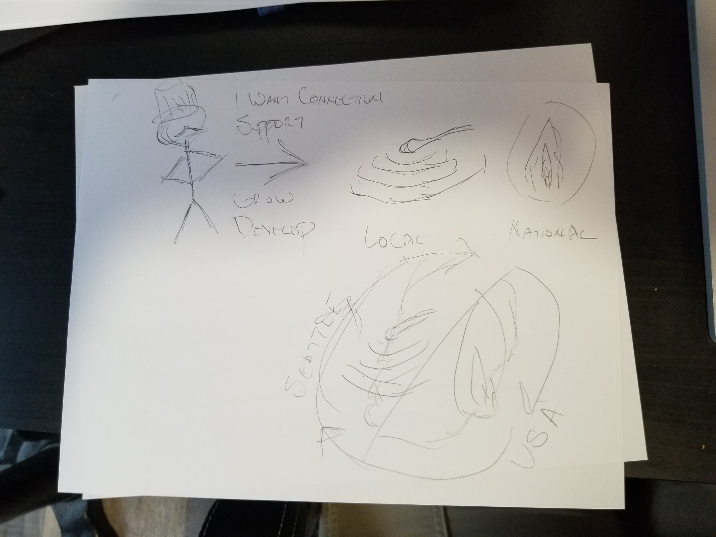
What was my process for finding potential solutions?
User Research
Our initial research consisted of the following methods:
Competitive Analysis of multiple websites so we could analyze how they handled common trouble areas
Donor Surveys to collect data on the pain points and desires that potential patrons have encountered when trying to donate elsewhere
Usability Testing of the current site to identify, classify and collect details on existing challenges from multiple perspectives
This resulted in the following insights from which we based our design work:
People want to relate to other people, not objects
“Photos should give a sense of who you are helping in the program. There is a lack of story - it would be nice to have a short video. Stock photos in a kitchen is not very inspiring.”
People want to understand connections and how local efforts can have a ripple effect
“There is a lot of text but it’s not telling me what exactly they do. Lots of mission statements that don’t take you anywhere.”
People want to know that they made a difference
“I would love to know where the money is going to go and what it will do. If I donated $100 and knew that $50 went towards job training, that would be really nice.”
Tell a story, simply in as few words as possible
“If there were fewer words and one statement that I could focus on with visuals, it would draw me in.”

Ideation
Affinity Diagramming
We took our findings from our Usability Testing of the existing site and performed an Affinity Diagramming exercise. Our goal was to identify the areas that impacted the FareStart user experience, the Catalyst Kitchens experience, or both.
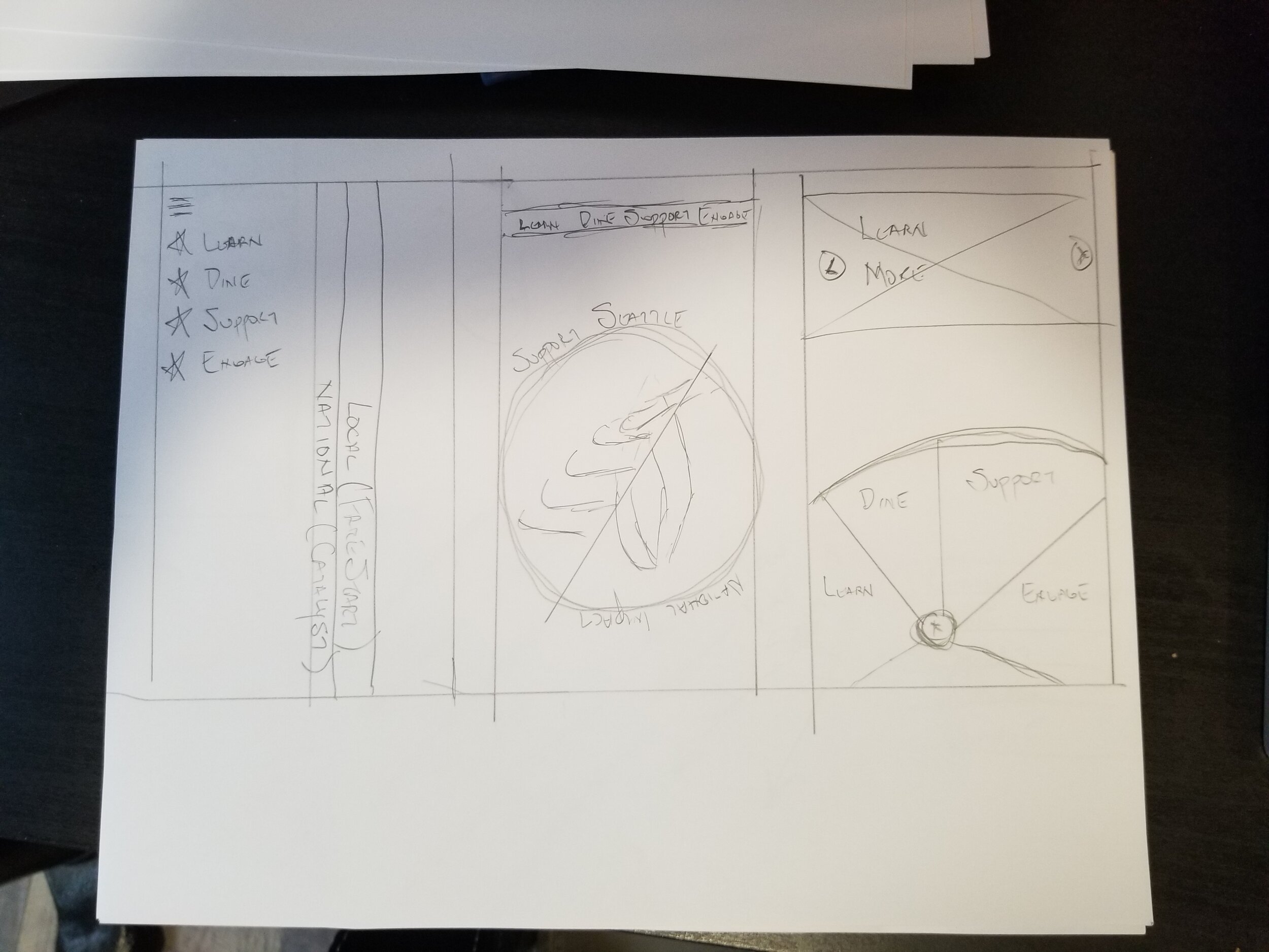
Sketching & Wire-framing
Show the relationship between FareStart and Catalyst Kitchens (their national initiative)
We wanted to come up with a graphical means of representing the relationship between FareStart and Catalyst Kitchens.


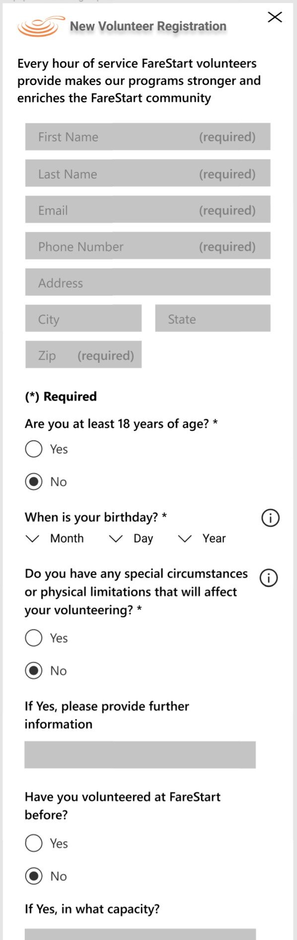
encourage people to volunteer
Next, we wanted to streamline the sign-up process and incorporate shift preferences over selection.


Drive FareStart support through donations
Finally, for the donor flow, we wanted to ensure that users go directly to the online options quickly and easily on either PC or mobile.


Prototyping
The examples provided below were picked to help showcase the solutions I created to address the issues identified during User Research and Ideation.
Re-design of the Home Page to focus on establishing an emotional connection
carousel
Each slide includes candid photos and stories and would be refreshed regularly.
Metrics
Data is provided to help illustrate the impact that each area has on its business space.
testimonials
Using the powerful words of first-hand experiences help users to feel closer to FareStart students and volunteers.
Video Library
FareStart invested heavily in high-quality promotional videos and is frequently showcased in the news. I wanted to make sure these valuable assets were easy to find and enjoy.
Special Event Highlight
FareStart frequently hosts community events. I wanted a space on Home dedicated to showcase these events and provide direct methods for users to get involved.
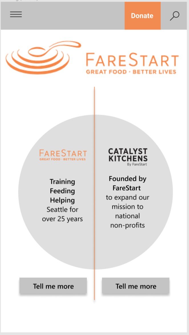
Smooth transition between FareStart and Catalyst Kitchens to ensure clear understanding of their relationships
tab control/SEAMLESS transition
To help re-enforce the separation between the local and North American initiatives, we provide a control at the top that allows the user to quickly flip between the two experiences.
Breaking down the walls of text by introducing complex subjects gradually
Progressive Disclosure
To address the word-dense portions of the site, we provide simple introductions to complex material and invite the user to dig deeper if they choose. If they wish to learn more, they can request additional detail using Information icons with pop-up dialogs.
Using tags, filters and practical examples to make it easier for patrons to maximize their impact
For Volunteers
Accordion Controls
As part of the mobile design, I wanted to optimize available space by taking advantage of accordion controls to hide content by category
Tags and Filters
All volunteer listings would have a robust selection of tags to help users identify the opportunities that were right for them
For Donors
Practical Examples
Examples of what regular donations provided to FareStart allows patrons to feel the impact of their gifts.
Other Ways to Donate
I felt it was important to showcase all the other methods by which a gift-giver could help the organization.
security info
I provided a highlight and info pop-up at the credit card section to provide details around how financial transactions are kept safe.
Where could I go from here?
If this project were to continue towards development, I would take the following steps:
Revisit the visibility of selected Tags and Tagging options in the Volunteer filters section. It’s hard what filter options to look for if you don’t know what’s available or what has already been applied.
Investigate options around letting users be able to adjust the way Volunteer options are grouped. Provide a pre-set method of grouping limits options for regular volunteers to customize their views.
Investigate other options for the transition control between FareStart and Catalyst Kitchens. I felt the final result did not stand out enough and did not play well on mobile.
Additional interviews and usability testing with potential patrons outside of friends and family would bring a more diverse perspective to the final design iteration.
What did I learn?
FareStart came back with very positive feedback regarding the solutions provided:
“(We) liked the pop-up boxes and volunteer sign-ups. Seeing how the volunteer experience could be improved spurred us to move to a new volunteer platform that can be integrated into the website and be a more user-friendly experience.”
My learnings listed below were based upon my personal observations and comments from instructors:
Unity of design is essential when putting together a solution for a client. When designing for future products, it is important to hand off clear and unified definitions of all objects, controls, and design elements. This will allow them to fully comprehend the intent behind all aspects of the design, carry it into development, and iterate on it in the future.
It would have been of value to re-evaluate the Information Architecture across both FareStart and Catalyst Kitchens websites and determine how we could have developed more sophisticated integration. By forcing ourselves to work within the existing IA, we ended up limiting our options and falling into pre-existing traps that resulted in a less-than-optimal final solution.